

Things look different around here at TrishaLyn.com (unless you’re reading this through a feed reader, then things are pretty much the same…)! I finally found a new theme from the fine folks at Elegant Themes that I’m happy with. It’s simple, but I like the top navigation and right hand sidebar WAY better than everything being on the left. I don’t know, it just seems more classic this way!
So, what did I change, you might ask?
Theme
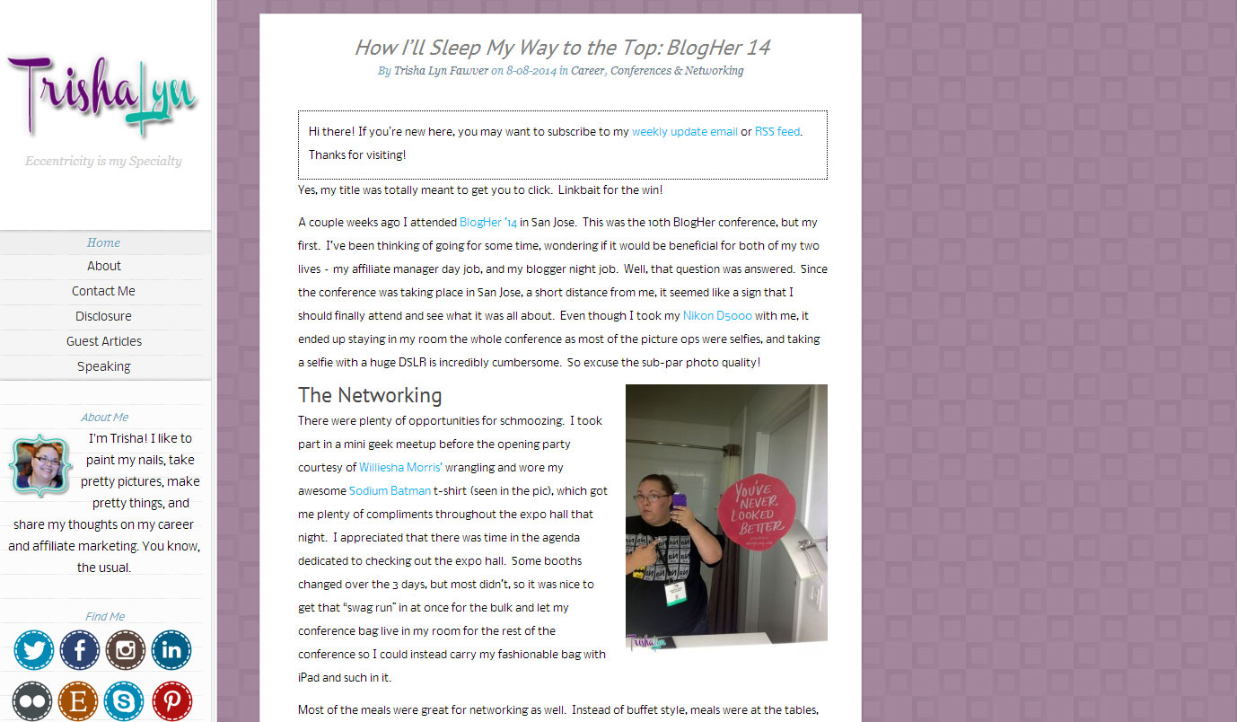 Before I was using a WordPress theme called Notebook. It worked well for about a year, but a few months ago I decided that it just wasn’t doing it for me anymore. I didn’t want to go crazy and make it more than it needed to be, but all the themes I was looking at were a bit much, or didn’t work with my current content without major customizations. My new theme is called Feather and it only took me about an hour to tweak the settings to get it to where I like it. I’m happy with the new look a lot more. I love the fun inclusion of the font Lobster in a way that’s legible and it’s not too far of a departure from the old look.
One of my beefs with the old look was all the wasted side space. There was no way to center the blog post, so it just looked off. This centers so it looks good on anyone’s screen. Which makes me happy.
Mobile
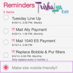 It’s been on my list of “things to do” for ages – make my site more mobile friendly. Turns out I was going about it all wrong. I’ve been looking for good themes that are “mobile responsive”, which means they’ll automatically adjust themselves if they detect that someone is viewing the website from a mobile phone. Little did I know, I had only to look again to Elegant Themes. They have a plugin called HandHeld that gives you a mobile version of your site with some limited customization available. It’s not 100% perfect, but it works way better than trying to load the standard site on one’s smartphone. So that item is officially crossed off of my to-do list!
Sidebar & Footer
Everything that was previously in the sidebar or footer is still there, except it’s just moved around a bit. I wanted to make my newsletter signups more prominent, but I also wanted to have my social media profiles easy to find. In the new theme, the very basic social media icons are actually up in the navigation bar (Facebook, Twitter, & RSS) so I felt okay moving my social media icons down to the footer to move the newsletter part up.
So… what do you think?
2 Comments
Join the conversation and post a comment.
The site’s lookin’ good!
Thanks Chrissy! I need to get on the award-winning bandwagon like yours 🙂